Thursday, 31 December 2015

Digipak ideas

Now that we have decided on a name for our album, i have began researching into ideas and examples that i could use for my digipak.

I really like Cheryl Cole's Only Human album design, Although the genre for our designs are completed different, i love the subtle use of a single strip to represent the use of an animal within. This is an idea i would love to incorporate into my design, by having a close up shot of our protagonist and a part to represent the animal within. A similar idea to mind is merging the animals face with the tiger, to represent her slowly turning into an animal.


For the font of the album, i extremely love the wild fonts that tend to be associated with the rock genre, although, a stereotype of rock is to have 'dark' music and with our track list to have this font style, it would conform to this stereotype. For instance, my chemical romance has a very messy style for their font, which i think adds a great effect to the design, as it also gives a hint to the audience what type of music the band produces, as when looking at the track list; (shown below) the track names link to the rock stereotype.

Finally, Rihanna's album displays a sense a 'animal' like behaviour with the pose she is doing on screen, making eye contract with the viewer but keeping half of her face in the dark. This is something i would like to portray.


After researching, i have some ideas of what i would like my digipak to look like.

Wednesday, 30 December 2015

Album Name - Animal

As a group we have finalized the name of our album. we decided to go for the name

ANIMAL

Our initial idea for calling our album animal, is for one, due to our song have animal like traits, but also, our track list entails a lot of 'dark' song titles. But also, using Saussure's theory of signified and signifies, hearing the word animal, everyone would have their view or what sort of animal and the characteristics this animal would have, or they would associate an animal to something else, rather than the mammal. I also like the idea that there are so many majestic animals out there. 

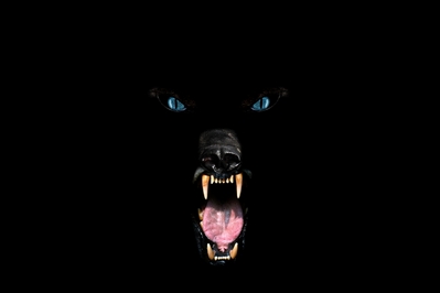
By having animal as the title, it gives us a big range of elements we could incorporate into the digipak and advertisement. My initial idea for this, is to have a rather dark animal to symbioses our album. like the examples below. 


Also with this sort of lighting it can completely change the way people perceive the animal, by creating a house pet something someone could be fearful of. 

Tuesday, 29 December 2015

Troye Sivan - Trxye

This album is by artist Troye Sivan, a very popular youtuber who has always had a passion for singing. He worked independently to release this indie genre album. It was released in 2014

Thursday, 24 December 2015

Paramore - Riot

This album by Paramore was released in 2007, it is called 'Riot' and they are part of the pop punk/ rock genre


Tuesday, 22 December 2015

The Script - #3

The Script released their 3rd studio album called '#3' in 2012. This band is part of the punk/rock genre


Thursday, 17 December 2015

Cheryl Cole - Only Human

Cheryl Cole is an artist from the pop genre, and this album, 'Only Human' was released in summer 2014. 


Tuesday, 15 December 2015

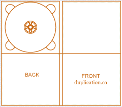
DigiPak template

Starting to look into digipaks and researching them, it is common for there to be very different styles and shapes for digipaks depending on the artist and genre. With there being ones with 4 sides up until 8 or even 10. Some have pockets for a little booklet or poster, some have a sleeve for it.


However after looking at all these, i have decided to go with a standard 4 sided one as it links to the idea of being simplistic for an independent artist.
The sizing for this is 13.95cm x 0,6cm x 12.55cm

Thursday, 10 December 2015

DigiPaks

A DigiPak is an alternative standard to a jeweled case to advertise and promote.

The benefits of a digipak compared to a jeweled case:

           -compact
           -Eco-friendly
           -movable/manageable
           -lighter
           -vintage
           -shatterproof
           -larger space for graphics
           -versatile
           -premium


A Digipak is normally made out of 300gsm card either mat or glossy varnish. Printed 4 colours (CYMK) or Patone spot varnish, lamination or emboss available

         
Generic conventions of a digipak are:

           -parental advisory
           -stickers
           -logo
           -track list
           -copyright
           -bar code
           -title
           -social media
           -website
           -reviews
           -produced by


Tuesday, 8 December 2015

Creativity

creativity
ˌkriːeɪˈtɪvɪti/
noun
  1. the use of imagination or original ideas to create something; inventiveness.

As we begin the process of editing our footage and creating our ancillary task there has been multiple creative decisions made, including:

locations/mise en scene: by going to more extravagant places and using props compared to our AS productions, as for example, our hospital scene, we used a wide range of props and built a set for this.
editing: we have began to play around with the colour of the scenes we filmed, by completely changing the saturation of our protagonist.
Camera: using more handheld shots, to create realism for the viewers and get a range of different shots with movement
Genre: at AS we stuck to the conventions perfectly, where as this year we feel more confident and tend to overt with the conventions for our genre
Software: using different software and techniques, using photoshop for our digipak and magazine article

Wednesday, 2 December 2015

Filming #4

On Tuesday we filmed the hospital scene that will be shown at the beginning half of our video. The scene consisted of our protagonist and 3 additional characters to play the doctors/paramedics. although in our shot they remain faceless as we only have their arms in the shot. The whole idea of this scene was to entail some choreography into our music video. By staying until after school hours, it meant we was able to have full resources to the photography room and the equipment needed to create the scene of a hospital. Overall our filming footage came out really well as we was concerned about the use of handheld shots. While we were on set, we changed the camera setting as we needed the handheld shots, we needed as much light as possibly but this ruined the mood of the footage, so we changed the exposure to -2 to create a darker scene to match our lyrical content.
The equipment we used was:
-a table
-pillows
-blankets
-black screen
-4 lights
-medical equipment
-medical separation curtains.
Below are some pictures and a vlog we took that day.

Tuesday, 1 December 2015

Audience Theorists #2


The Hypodermic Needle Theory


This theory represents the media, a powerful source, spoon feeding/ injecting ideas into peoples mind. As the audience are displayed as weak, passive and easy to 'drug'. This suggests that a media text/media group can 'inject' ideas, values and attitudes into the passive part of audience as they will believe there is only one way to look at it.

Uses and Gratifications Model

This theory link sup with Maslow's Hierarchy of Needs, as the model stems from the idea that a complex audience will select media texts to suit them. These audience's are known to be active and make active decisions about it all. According to this theory, we all have different uses for the media text and makes choices over what we want to watch. Blumier and Katz (1975) went into further detail about this, and identified the 4 main uses:

Surveillance- our need to know what is going on in the world, relating to maslow's need of security. By keeping up to date with news about local and international events we feel we have the knowledge to avoid or deal with dangers. We satisfy our curiosity and also feel safer.
Personal Relationships/social interactions- our need to interact with other people. This is provided by forming virtual relationships with characters in soaps, films and all kinds of drama, and other programs and media texts.
Personal Identity- our need to identify ourselves. Part of our sense of self is informed by making judgements about all sorts of people and things. This is also true of judgements we make about TV and Film characters and celebrities. Our choice of music, the shows we watch, the stars we like can be  an expression of our identity. one aspect of this type of gratification is known as the value reinforcement. this is where we choose television programmes or newspapers that have similar beliefs to those we hold. we can identify and relate to characters or their situations
Diversion- the need for escape, entertainment and relaxation. All types of television programmes can be 'used' to wind down and offer diversion, as well as satisfying some of the other needs at the same time.

This whole theory contradicts the hypodermic needle theory.

Reception Analysis

this is an active audience theory that looks into how audiences interact with a media text, taking into consideration their 'situated culture'- this is their daily life.
the theory was put forward by Stuart Hall with later research by David Morley and Charlotte Brunsden.

there are three ways an audience can be categorized

The dominant or preferred reading - the audience shares the code of the text and fully accepts its preferred meaning as intended by the producers.
The negotiated Reading - The audience partly shares the code of the text and broadly accepts the preferred meaning but can change the meaning in some way according to their own preferences.
The oppositional reading- the audience understands the preferred meaning but does not share the texts code and rejects this intended meaning. This can be called radical reading that may be, say Marxism or feminist or right wing.

Friday, 27 November 2015

Change of Plan..

After the BFI trip, my group and i decided to change our narrative slightly, as we were having some trouble relying on another character outside our media group. We decided that we would make our idea more simplistic as Director to the Famous Adele 'Hello' Video Xavier Dolan states
"The look"
beats
"The idea"
It made us realise that we complicated the idea too much, considering the resources we have are minimal.  Bringing on the 10 steps Tom Woodcock, the speaker, said. 

1.Assess your resources: the technical kit, the performer, the locations and props/costumes used.
2. Warm Up: do some testers such as a lip sync practice, photo shoot, remake a music video etc
3.Recce: having limited locations, floor plan, lighting and power source
4.Pitch: if you cant explain your idea to someone, then maybe the idea may not be the best. you could also create a mood board, production tasks etc. 
5:Planning beats Ideas: this is what we lack on, lack of planning, but not having a clear idea of what we want to achieve at the set.
6:Plan everything!
7:shoot: shoot 10 times, plenty of cutaways, record more than less, think of the lighting. 
8:edit: make it sync, paper edit(animation)
9:Evidence
10:Evaluation 

With these 10 steps it gave us a lot to think about. We feel we have come up with a better way to portray the narrative of our production, as we have a simplistic idea. We will be keeping a lot of the same shoots, however, like stated above, we have had multiple days were filming has not gone to plan due to the male protagonist, so we tries to think of a way to exclude him so we can have just one narrative. Our idea is to show our protagonist being trapped physically, then as she just gets freedom, she realises she is still being held back. As our song simple focuses on freeing the animal. Which we feel is a metaphor for her.  

Thursday, 26 November 2015

BFI

Today our media class went to the BFI in London to help us with our coursework. It gave us a lot of inspiration for our idea. From this we learnt about the history of music videos, saw some students work and learnt 10 steps to make the best music video.
Below are all the resources shown at the session.

Below are all the videos featured in the presentations as they will not play.


The student videos shown

And some Photos taken on the day.


Tuesday, 24 November 2015

Inspirational Music Video #16 - Emperor's New clothes


What particularly interests me with this music video is the continuation from a video that is a few years old. The montage at the beginning reminds the viewer what has happened, as we see the protagonist enter a light, this symbolizes his fate which leads him into hell. In this video, and This Is Gospel, the camera movements for it are sublime, with the smooth motion and it being one long shot, rather than being edited together. There is one part of this video that i absolutely love, which is the video below. 

The shot is really effective as it gives off the sense of worry, with how quick he would be moving, as the camera is positioned as the viewers eyes. Researching into the video, it shows the behind the scenes of the protagonist recording the video, as you see the set and him getting ready with the make up. It fascinates me, the illusion that a camera can create, after watching the video, you start to 'belive' he is in hell, however when you watch the behind the scenes, you notice the small area with all the props. 
Overall this video is extremely theatrical with the idea to the costume, it engages the audience with the weird idea of him slowly developing into the devil. 

Monday, 23 November 2015

Filming day 3

Today we began filming the bridge of our song, we went to hilly fields and tried to create the opposite effect of the shots we filmed on friday, as again, these shits are rather dark and mysterious, as you are unable to see the background clearly due to how dark it was. We used the lights to make sure Lauren was clear, as we first shot, we started to move the light to see the effect it created. We feel this effect worked well with the lyrics and the expression on Lauren's face, as the lyrics are rather 'dark' yet again, we wanted lauren to show that she has finally lost control. The lighting effect worked as we shook it quick so it had lauren appearing and disappearing on the camera. However, the only problem with this is that due to the poor lighting the quality of the video might not be the best as Lauren was moving so she may have appeared out of focus, but this is something we will have a look at as a group and if we realise its a problem, we will refill. 
Below are some pictures from filming and blogs.


Sunday, 22 November 2015

Beyond the Video


As we are choreographing our main scene, I've done some further research in how the director produced it, and came across this beyond the video. This reveals the typical setting for the scene and the lights used, mainly the light positioned above the table, which would cause for a handheld light that attaches to the camera. This also explained how tight the choreography has to be, as she mentioned that even one slight move, would ruin the whole effect. This means that there will be plenty of test runs and trial and errors to make sure this scene is correct with no error's at all.

Saturday, 21 November 2015

Composition, Rule of Thirds and diagonal lines

What is Composition?
The term “composition” applies not only to visual arts, but to music, dance, literature and virtually any other kind of art. In certain contexts, such as writing, this term may not be as widely used, but is just as valid nonetheless. In general, the term “composition” has two distinctive, yet related meanings.
First and foremost, “composition” describes placement of relative objects and elements in a work of art. Consequently, composition is a key aspect of a good work of art. There is hardly a way to overemphasize the importance of composition. Any aspiring artist ought to give composition of his work a lot of attention. A good composition is one that has just enough detail. Too few elements is bad because it robs the work of art of necessary detail that makes correct interpretation possible. It also ruins the balance of an image. And too many elements can be very distracting as well. Good composition requires good balance. It is best to make sure all the elements present are necessary for the idea or story you are trying to pass on.
What is Rule of Third? 
The rule of thirds is applied by aligning a subject with the guide lines and their intersection points, placing the horizon on the top or bottom line, or allowing linear features in the image to flow from section to section.
What is the use of Diagonal Lines?
Diagonal lines generally work well to draw the eye of an image’s viewer through the photograph. They create points of interest as they intersect with other lines and often give images depth by suggesting perspective.They can also add a sense of action to an image and add a dynamic looks and feel.

Friday, 20 November 2015

Filming day 2

Today our group went to forty hall to film, with the weather in our favour for the appearance, although it being bitterly cold. Our idea behind todays footage was to get Our protagonist Lauren in the forest, as it is an unusual location, and with our narrative we wanted the audience t feel confused, it also creates a contrast in the video as at the moment, our footage and the footage we plan to film, it is all rather dark to match the lyrical content of the song. So by having Lauren in the forest, still having a 'Dark' side to it but just visually contrasting. Here we also got some shots from our inspirational videos, which we need to look at and edit to see if it works well or not. We managed to get some great shots that will hopefully portray our narrative.
Here are some location shots and a vlog of us filming:


Thursday, 19 November 2015

Inspirational Music Video #15- Wasn't Expecting That


Jamie Lawson portrays the journey of life within a 3 minute music video, he shows the ups and downs or a couple in love. The concept of the video matches the lyrical content perfectly. However, the video is rewinding time, showing them in their elderly age, as it reverts back to their young love days, at the end of the video, they show the couple in the hardest part of saying goodbye. I feel this was effective as it gave the audience a chance to learn about the life of these two, they understood the love they have for each other, making the sad ending sudden, this also makes you remember the video if it touches you personally. Having the sudden twist in the end, after the happy song, with cheerful lyrics, also makes the video more memorable for audiences. I love the idea of reversing the time, and then going back to the ending, this gives the sense of a flashback video.

Editing test


With the footage we have shot beforehand, we started to play around with all the different colours, seeing what effects would work well together and if there is any colours that worked extremely well together or did not work well at all. This also got us familiar with the new Imovie. 
From this, we have figured out we will defiantly use the overlaying of the shots, as they all seem really effective.  Below are some screenshots from the footage. Personally, i feel that image 3 did not work well at all, and was not what we imagined the outcome, as overlapping the negative effect lost the vibrant and bold colour of the pink. And we feel that the effects that work the best are the overlapping of two different shots and colours, the slight 'lag' overlap, where we have the same shot, in the same colour or different, and we just have it start a second later, and finally, we love the sections where one part is in the foreground and one is in the background, as we crop the image to make it closer up, as this could show the animal trapped inside with the positioning of the shots. 

Crop section
Lag
Negative 
Crop 
Lag

Tuesday, 17 November 2015

Digipaks

Digipaks are a type of packaging for CD's and DVD's, typically made from cardboard with an internal section of plastic to hold the disk. They are typically Gatefolds, which is a book style, with  a paperboard or card stock outer binding.
Digipaks are known as the first alternative jewel cases for major record companies as it began in 2000. Digipak styles are often used for Cd singles or special editions of the album. with the digipak being most commonly cardboard, it is suggested that they protect it with a UV coating to insure the reduce risk of it getting damaged. The CD itself is normally packaged with 'teeth' of the hub to secure the disk.
Digipaks come in many styles, but most popular are a standard 4 side one or having a pocket inside to put in a booklet on the CD/ track.
Digipak with pocket
Digipak template
Below are some examples of some Digipaks.

The xx
Nirvana
My chemical Romance